Yale climate opinion maps visualize American attitudes toward warming
The Yale Program on Climate Change Communication has produced a great set of maps that illustrate what Americans think about global warming. What’s special about these maps is their high-resolution: you can zoom in to understand public opinion on the level of states, counties, congressional districts, and metropolitan areas.
None of the questions mention water explicitly, but because climate change is manifesting most conspicuously in the hydrologic cycle (see California’s whipsaw between historic drought and flooding), the findings from this research may be useful to the water community.
The survey questions, which have been asked from 2008 to 2016, cover a variety of climate change topics, including the cause of global warming, the impact on people’s lives, and attitudes toward low-carbon policies.
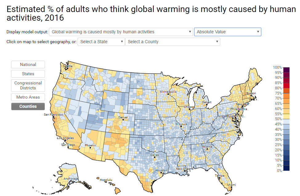
The map below is just one example from the Yale project’s website. It shows what percent of adults in each county think global warming is mostly caused by human activities.
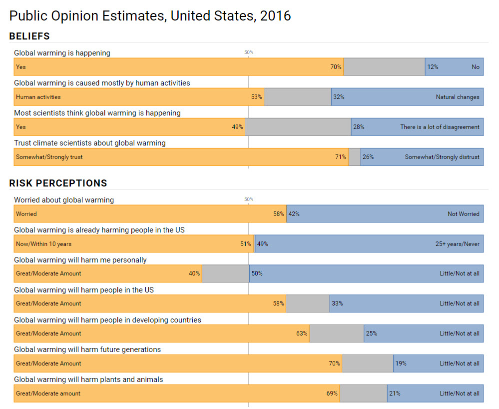
At the national level, the 2016 survey found 70% of Americans believe global warming is happening and 58% say they’re worried, but only 53% percent think climate change is caused mostly by humans. Although 71% of Americans trust climate scientists, only 49% say that most scientists think global warming is happening and 28% say there is lots of disagreement. In reality, virtually all climate scientists believe global warming is occurring and largely attributable to human activity. As I’ve noted in previous posts, climate change is highly polarized and politically charged, whereas water issues tend to be more bipartisan. The graphic below summarizes the 2016 national-level results.
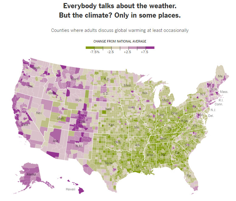
The New York Times did a nice piece on the research last month and produced some maps of their own using the data. The one below shows that climate change is discussed more frequently in New England and West of the 100th Meridian, perhaps because warming’s impact has been especially noticeable in these regions. Record heat, brutal droughts, deadly flooding, explosive wildfires, and phantom ski seasons are all conversation starters.
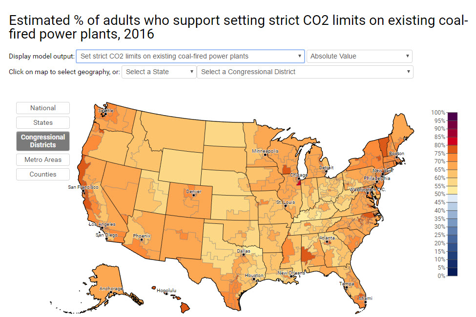
The map above uses colors to show how far above or below a county is compared to the national average. The Yale maps also allow you to visualize the absolute numbers, as shown in the example below, which depicts congressional districts and support for regulating carbon dioxide emissions from coal plants. I was surprised to find no congressional districts where a majority of voters oppose such a measure.
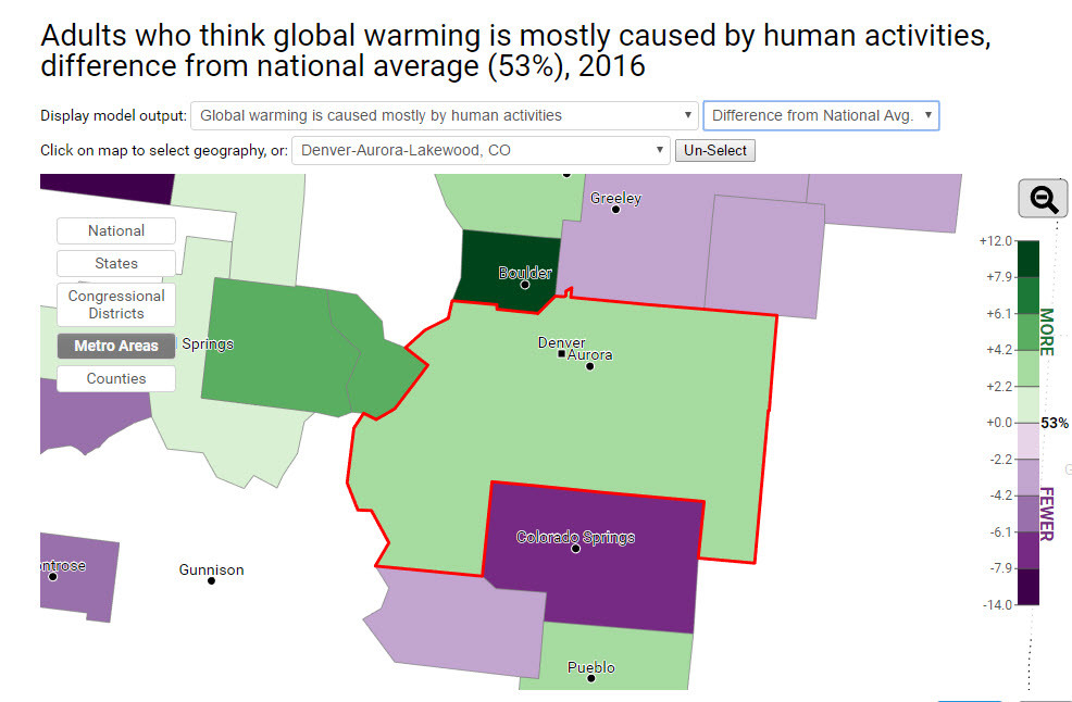
The mapping tool really gets interesting when you zoom into individual states or metropolitan areas. For example, I was curious about climate opinion around my home in Denver and created the map below. As you would expect, public attitudes along the Colorado Front Range run the gamut from Boulder, the quintessential liberal college town, to more conservative Colorado Springs, home to Focus on the Family and the U.S. Air Force Academy.
Public opinion data is typically reported at the national and state level, but that geographic resolution can sometimes hide more than it reveals. The Yale climate maps show how a finer grained analysis can illuminate significant differences in opinion on the local level. I’m not aware of any similarly detailed data on water-related public opinion, but such information could provide a wealth of insight to local communities wrestling with water challenges.
Methodology
You may be wondering how in the world the researches got data on more than 3,000 counties and hundreds of metro areas. In fact, they didn’t poll residents of every county, congressional district, or metropolitan area. Rather, they used some fancy statistical techniques to extrapolate from a large national survey with more than 18,000 responses. The researchers also used city and state surveys, as well as third-party data, to supplement their analysis and check their estimates. Here’s an excerpt from the Yale website describing the data:
Public opinion estimates are produced using a statistical model based on national survey data gathered between 2008 and 2016 by the Yale Program on Climate Change Communication and the George Mason Center for Climate Change Communication. The Global Warming’s Six Americas segments are determined using 36 survey items that include questions about climate change beliefs, risk perceptions, behaviors, and policy support. “Metro” areas include both metropolitan and micropolitan areas as defined by the U.S. Census Bureau. For details see methods and Howe, P., Mildenberger, M., Marlon, J.R., and Leiserowitz, A., “Geographic variation in opinions on climate change at state and local scales in the USA,” Nature Climate Change. DOI: 10.1038/nclimate2583.
Resources
- Yale Program on Climate Change Communication
- “How Americans Think About Climate Change, in Six Maps,” The New York Times, March 21, 2017
- “Geographic variation in opinions on climate change at state and local scales in the USA,” Peter D. Howe et al., Nature Climate Change, 596–603
WaterPolls.org aggregates, analyzes, and visualizes public opinion data on water-related issues. Stay informed via Twitter, Facebook, Pinterest, RSS, and email.


